
Flex ColorPicker控件
 Flex 表单控件
介绍
ColorPicker控件为用户提供了从样本列表中选择颜色的方法。默认模式是在方形按钮中显示单个样本。
当用户单击色板按钮时,将显示色板面板,并显示整个色板列表。
类声明
以下是 mx.controls.ColorPicker 类的声明:
public class ColorPicker
   extends ComboBase
公共财产
| S.N. | 属性和描述 |
|---|---|
| 1 |
colorField:String dataProvider数组的对象中的字段名称,指定样本面板显示的颜色的十六进制值。 |
| 2 |
labelField:String dataProvider数组的对象中的字段名称,其中包含要在SwatchPanel对象文本框中显示为标签的文本。 |
| 3 |
selectedColor:uint SwatchPanel对象中当前选定颜色的值。 |
| 4 |
selectedIndex:int [override] SwatchPanel对象中所选项的dataProvider中的索引。 |
| 5 |
showTextField:Boolean 指定是否显示显示颜色标签或十六进制颜色值的文本框。 |
受保护的属性
| S.N. | 属性和描述 |
|---|---|
| 1 |
swatchStyleFilters:Object [只读]从ColorPicker传递到预览色板的样式集。 |
公共方法
| S.N. | 方法和描述 |
|---|---|
| 1 |
ColorPicker() 构造函数。 |
| 2 |
close(trigger:Event = null):void 隐藏下拉SwatchPanel对象。 |
| 3 |
open():void 显示下拉SwatchPanel对象,该对象显示用户可以选择的颜色。 |
事件
| S.N. | 事件和描述 |
|---|---|
| 1 |
显示下拉SwatchPanel对象,该对象显示用户可以选择的颜色。... 当所选颜色因用户交互而更改时分派。 |
| 2 |
close 样本面板关闭时分派。 |
| 3 |
enter 如果ColorPicker可编辑属性设置为true,并且用户在键入十六进制颜色值后按Enter键,则分派。 |
| 4 |
itemRollOut 当用户将鼠标从SwatchPanel对象中的样本滚出时分派。 |
| 5 |
itemRollOver 当用户将鼠标悬停在SwatchPanel对象中的样本上时分派。 |
| 6 |
open 在颜色样本面板打开时分派。 |
继承的方法
此类继承以下类中的方法:
mx.controls.comboBase
mx.core.UIComponent
mx.core.FlexSprite
flash.display.Sprite
flash.display.DisplayObjectContainer
flash.display.InteractiveObject
flash.display.DisplayObject
flash.events.EventDispatcher
Object
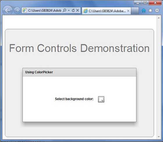
Flex ColorPicker控件示例
让我们按照以下步骤,通过创建测试应用程序来检查Flex应用程序中ColorPicker控件的使用情况:
| 步骤 | 描述 |
|---|---|
| 1 | 在 Flex - 创建应用程序章节中所述,在包 com.tutorialspoint.client 下创建名为 HelloWorld 的项目。 |
| 2 | 修改 HelloWorld.mxml ,如下所述。 保持文件的其余部分不变。 |
| 3 | 编译并运行应用程序,以确保业务逻辑按照要求工作。 |
以下是修改后的mxml文件 src / com.tutorialspoint / HelloWorld.mxml 的内容。
<?xml version="1.0" encoding="utf-8"?>
<s:Application xmlns:fx="http://ns.adobe.com/mxml/2009"
   xmlns:s="library://ns.adobe.com/flex/spark"
   xmlns:mx="library://ns.adobe.com/flex/mx"
   width="100%" height="100%" minWidth="500" minHeight="500"
   >
   <fx:Style source="/com/tutorialspoint/client/Style.css"/>
      <s:BorderContainer width="550" height="400" id="mainContainer"
   styleName="container">
      <s:VGroup width="100%" height="100%" gap="50"
      horizontalAlign="center" verticalAlign="middle">
         <s:Label id="lblHeader" text="Form Controls Demonstration"
         fontSize="40" color="0x777777" styleName="heading"/>
         <s:Panel id="colorPickerPanel"
            backgroundColor="{colorPicker.selectedColor}"
            title="Using ColorPicker" width="420" height="200">
            <s:layout>
               <s:HorizontalLayout  gap="10" verticalAlign="middle"
               horizontalAlign="center"/>
            </s:layout>
            <s:Label width="150" color="black"
            text="Select background color: " fontWeight="bold"/>
            <mx:ColorPicker id="colorPicker"
            showTextField="true" selectedColor="0xFFFFFF"/>
         </s:Panel>
      </s:VGroup>
   </s:BorderContainer>
</s:Application>
准备好所有更改后,让我们以正常模式编译和运行应用程序,就像在 Flex - 创建应用程序中一样 章节。 如果一切顺利,您的应用程序,这将产生以下结果: