
Flex ComboBox控件
 Flex 表单控件
介绍
当用户从ComboBox控件中的下拉列表中选择一个项目时,数据项将显示在控件的提示区域中。
ComboBox和DropDownList控件之间的一个区别是ComboBox控件的提示区域是通过使用TextInput控件实现的,而在DropDownList控件的情况下,它是Label控件。 因此,用户可以编辑控件的提示区域,以输入不是可用选项之一的值。
类声明
以下是 spark.components.ComboBox 类的声明:
public class ComboBox
   extends DropDownListBase
      implements IIMESupport
公共财产
| S.N. | 属性和描述 |
|---|---|
| 1 |
enableIME:Boolean [只读] |
| 2 |
imeMode:String |
| 3 |
itemMatchingFunction:Function = null 指定用于在用户在提示区域中输入字符时用于搜索项目列表的回调函数。 |
| 4 |
labelToItemFunction:Function 指定回调函数,将输入提示区域的新值转换为与数据提供者中的数据项相同的数据类型。 |
| 5 |
maxChars:int The maximum number of characters that the prompt area can contain, as entered by a user. |
| 6 |
openOnInput:Boolean = true 如果为true,则当用户编辑提示区域时,下拉列表将打开。 |
| 7 |
prompt : String 如果/当输入文本为null时要显示的文本。 |
| 8 |
restrict:String 指定用户可以在提示区域中输入的字符集。 |
公共方法
| S.N. | 方法和描述 |
|---|---|
| 1 |
ComboBox() 构造函数。 |
继承的方法
此类继承以下类中的方法:
spark.components.supportClasses.DropDownListBase
spark.components.List
spark.components.supportClasses.ListBase
spark.components.SkinnableDataContainer
spark.components.supportClasses.SkinnableContainerBase
spark.components.supportClasses.SkinnableComponent
mx.core.UIComponent
mx.core.FlexSprite
flash.display.Sprite
flash.display.DisplayObjectContainer
flash.display.InteractiveObject
flash.display.DisplayObject
flash.events.EventDispatcher
Object
Flex组合框控件示例
让我们按照以下步骤通过创建测试应用程序来检查Flex应用程序中ComboBox控件的使用:
| 步骤 | 描述 |
|---|---|
| 1 | 在 Flex - 创建应用程序章节中所述,在包 com.tutorialspoint.client 下创建名为 HelloWorld 的项目。 |
| 2 | 修改 HelloWorld.mxml ,如下所述。 保持文件的其余部分不变。 |
| 3 | 编译并运行应用程序,以确保业务逻辑按照要求工作。 |
以下是修改的mxml文件的内容 src / com.tutorialspoint / HelloWorld.mxml
<?xml version="1.0" encoding="utf-8"?>
<s:Application xmlns:fx="http://ns.adobe.com/mxml/2009"
   xmlns:s="library://ns.adobe.com/flex/spark"
   xmlns:mx="library://ns.adobe.com/flex/mx"
   width="100%" height="100%" minWidth="500" minHeight="500"
   >

   <fx:Style source="/com/tutorialspoint/client/Style.css"/>

   <fx:Script>
      <![CDATA[
         import mx.collections.ArrayCollection;

         [Bindable]
         public var data:ArrayCollection = new ArrayCollection(
         [
            {value:"France", code:"FR"},
            {value:"Japan", code:"JP"},
            {value:"India", code:"IN"},
            {value:"Russia", code:"RS"},
            {value:"United States", code:"US"}
         ]
         );

         private function mappingFunction(input:String):Object
         {
            switch (input){
               case "France":
                  return {value:input, code:"FR"};
               case "Japan":
                  return {value:input, code:"JP"};
               case "India":
                  return {value:input, code:"IN"};
               case "Russia":
                  return {value:input, code:"RS"};
               case "United States":
                  return {value:input, code:"US"};
            }
            return null;
         }

      ]]>
   </fx:Script>
   <fx:Declarations>
      <mx:DateFormatter id="dateFormatter" />
   </fx:Declarations>
   <s:BorderContainer width="550" height="400" id="mainContainer"
   styleName="container">
      <s:VGroup width="100%" height="100%" gap="50" horizontalAlign="center"
      verticalAlign="middle">
         <s:Label id="lblHeader" text="Form Controls Demonstration"
         fontSize="40" color="0x777777" styleName="heading"/>
         <s:Panel id="comboBoxPanel" title="Using ComboBox" width="420"
         height="200">
         <s:layout>
            <s:VerticalLayout  gap="10" verticalAlign="middle"
            horizontalAlign="center"/>
         </s:layout>
         <s:HGroup>
            <s:Label text="Index :"/> <s:Label
            text="{comboBox.selectedIndex}" fontWeight="bold"/>
            <s:Label text="Value :"/> <s:Label
            text="{comboBox.selectedItem.value}" fontWeight="bold"/>
            <s:Label text="Code :"/> <s:Label
            text="{comboBox.selectedItem.code}" fontWeight="bold"/>
         </s:HGroup>
         <s:ComboBox  id="comboBox"  dataProvider="{data}" width="150"
            labelToItemFunction="{mappingFunction}" selectedIndex="0"
            labelField="value"/>
         </s:Panel>
      </s:VGroup>
   </s:BorderContainer>
</s:Application>
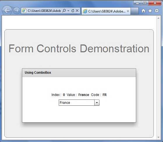
准备好所有更改后,让我们以正常模式编译和运行应用程序,就像在 Flex - 创建应用程序中一样 章节。 如果一切顺利,您的应用程序,这将产生以下结果:]