

Bootstrap 警告
本章将讲解警告(Alerts)以及 Bootstrap 所提供的用于警告的 class。警告(Alerts)向用户提供了一种定义消息样式的方式。它们为典型的用户操作提供了上下文信息反馈。
您可以为警告框添加一个可选的关闭按钮。为了创建一个内联的可取消的警告框,请使用 警告(Alerts) jQuery 插件。
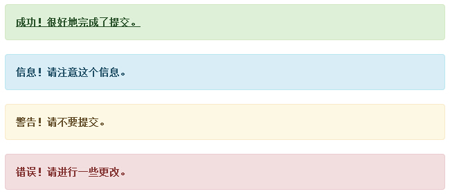
您可以通过创建一个 <div>,并向其添加一个 .alert class 和四个上下文 class(即 .alert-success、.alert-info、.alert-warning、.alert-danger)之一,来添加一个基本的警告框。下面的实例演示了这点:
<!DOCTYPE html>
<html>
<head>
 <title>Bootstrap 实例 - 警告(Alerts)</title>
 <link href="/bootstrap/css/bootstrap.min.css" rel="stylesheet">
 <script src="/scripts/jquery.min.js"></script>
 <script src="/bootstrap/js/bootstrap.min.js"></script>
</head>
<body>

<div class="alert alert-success">成功!很好地完成了提交。</div>
<div class="alert alert-info">信息!请注意这个信息。</div>
<div class="alert alert-warning">警告!请不要提交。</div>
<div class="alert alert-danger">错误!请进行一些更改。</div>


</body>
</html>
结果如下所示:
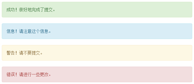
可取消的警告(Dismissal Alerts)
创建一个可取消的警告(Dismissal Alert)步骤如下:
- 通过创建一个 <div>,并向其添加一个 .alert class 和四个上下文 class(即 .alert-success、.alert-info、.alert-warning、.alert-danger)之一,来添加一个基本的警告框。
- 同时向上面的 <div> class 添加可选的 .alert-dismissable。
- 添加一个关闭按钮。
下面的实例演示了这点:
<!DOCTYPE html>
<html>
<head>
<title>Bootstrap 实例 - 可取消的警告(Dismissal Alerts)</title>
<link href="/bootstrap/css/bootstrap.min.css" rel="stylesheet">
<script src="/scripts/jquery.min.js"></script>
<script src="/bootstrap/js/bootstrap.min.js"></script>
</head>
<body>
<div class="alert alert-success alert-dismissable">
<button type="button" class="close" data-dismiss="alert"
aria-hidden="true">
×
</button>
成功!很好地完成了提交。
</div>
<div class="alert alert-info alert-dismissable">
<button type="button" class="close" data-dismiss="alert"
aria-hidden="true">
×
</button>
信息!请注意这个信息。
</div>
<div class="alert alert-warning alert-dismissable">
<button type="button" class="close" data-dismiss="alert"
aria-hidden="true">
×
</button>
警告!请不要提交。
</div>
<div class="alert alert-danger alert-dismissable">
<button type="button" class="close" data-dismiss="alert"
aria-hidden="true">
×
</button>
错误!请进行一些更改。
</div>
</body>
</html>
请确保使用带有 data-dismiss="alert" data 属性的 <button> 元素。
结果如下所示:
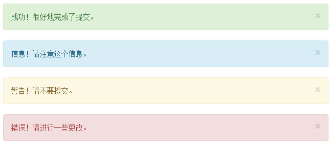
警告(Alerts)中的链接
在警告(Alerts)中创建链接的步骤如下:
- 通过创建一个 <div>,并向其添加一个 .alert class 和四个上下文 class(即 .alert-success、.alert-info、.alert-warning、.alert-danger)之一,来添加一个基本的警告框。
- 使用 .alert-link 实体类来快速提供带有匹配颜色的链接。
<!DOCTYPE html>
<html>
<head>
 <title>Bootstrap 实例 - 警告(Alerts)中的链接</title>
 <link href="/bootstrap/css/bootstrap.min.css" rel="stylesheet">
 <script src="/scripts/jquery.min.js"></script>
 <script src="/bootstrap/js/bootstrap.min.js"></script>
</head>
<body>

<div class="alert alert-success">
 <a href="#" class="alert-link">成功!很好地完成了提交。</a>
</div>
<div class="alert alert-info">
 <a href="#" class="alert-link">信息!请注意这个信息。</a>
</div>
<div class="alert alert-warning">
 <a href="#" class="alert-link">警告!请不要提交。</a>
</div>
<div class="alert alert-danger">
 <a href="#" class="alert-link">错误!请进行一些更改。</a>
</div>


</body>
</html>
结果如下所示: