

Bootstrap 按钮
 Bootstrap v2 教程
目标
按钮广泛应用于网站或应用程序中。在本教程中,我们将通过实例、实例解释来讨论如何使用 Boostrap 3 按钮,以及如何定制默认的按钮。
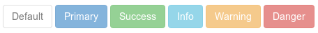
使用默认的按钮
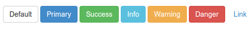
下面的实例将演示如何通过 Bootstrap 3 快速创建按钮。
实例
<html>
<head>
<title>Bootstrap 3 默认按钮</title>
<meta name="viewport" content="width=device-width, initial-scale=1.0">
<!-- Bootstrap -->
<link href="dist/css/bootstrap.min.css" rel="stylesheet" media="screen">
<style>
body {
padding: 50px
}
</style>
<!-- HTML5 Shim and Respond。js IE8支持 HTML5 原始和媒体查询。 -->
<!-- WARNING: Respond。如果通过file://查看页面js将不工作。 -->
<!--[if lt IE 9]>
<script src="https://oss.maxcdn.com/libs/html5shiv/3.7.0/html5shiv.js"></script>
<script src="https://oss.maxcdn.com/libs/respond.js/1.3.0/respond.min.js"></script>
<![endif]-->
</head>
<body>
<!-- 标准按钮 -->
<button type="button" class="btn btn-default">默认</button>
<!-- 提供额外的视觉效果,标识一组按钮中的原始动作 -->
<button type="button" class="btn btn-primary">原始</button>
<!-- 表示一个成功的或积极的动作 -->
<button type="button" class="btn btn-success">成功</button>
<!-- 信息警告消息的上下文按钮 -->
<button type="button" class="btn btn-info">信息</button>
<!-- 表示应谨慎采取的动作 -->
<button type="button" class="btn btn-warning">警告</button>
<!-- 表示一个危险的或潜在的负面动作 -->
<button type="button" class="btn btn-danger">危险</button>
<!-- 并不强调是一个按钮,看起来像一个链接,但同时保持按钮的行为 -->
<button type="button" class="btn btn-link">链接</button>
<!-- jQuery (对Bootstrap的 JavaScript插件来说是必要的--->
<script src="https://code.jquery.com/jquery.js"></script>
<!-- 包括所有已编译的插件(如下),或者根据需要包括单个文件 -->
<script src="dist/js/bootstrap.min.js"></script>
</body>
</html>
以上代码输出如下。您可以点击这里,在线查看实例。
CSS
我们将来探讨一下用来创建这些按钮的 CSS 规则。用于创建按钮的主要的 class 是 btn,如下所示。
.btn {
  display: inline-block;
  padding: 6px 12px;
  margin-bottom: 0;
  font-size: 14px;
  font-weight: normal;
  line-height: 1.428571429;
  text-align: center;
  white-space: nowrap;
  vertical-align: middle;
  cursor: pointer;
  background-image: none;
  border: 1px solid transparent;
  border-radius: 4px;
  -webkit-user-select: none;
     -moz-user-select: none;
      -ms-user-select: none;
       -o-user-select: none;
          user-select: none;
}
由于上面的 CSS 代码,按钮(带有 btn class)呈现为 inline-block,允许按钮与其具有共同基线的相邻元素内联呈现,但是您可以给它添加 width 和 height 属性。它的顶部填充和底部填充分别为 6 和 12 像素。底部外边距设置为 0。
字体尺寸设置为 14 像素,且字体的粗细设置为 normal。带有 btn class 的按钮行高为 1.428571429,比默认高度 1 稍高一点。文本居中对齐。
white-space 属性设置为 nowrap,所以新行、空格和制表符将会折叠。相关的垂直居中的元素将会定位于高度的中间。当您把鼠标悬浮于相关元素之上时,光标会呈现为指针形状。这里不会显示背景图片。
这里将会呈现一个透明的,1 像素粗的实体边框。由于 border-radius: 4px;,相关按钮的边角将是圆角状的。通过增加或减少值 4px,您可以让圆角的圆度变得更大或更小。由于 user-select: none,相关按钮及子元素的文本将不可选。为了获得跨浏览器的一致性,相同的属性在应用时带有多个供应商的前缀。
上面实例中显示的每个按钮除了 btn 之外还有另一个 CSS class,比如 btn-default、btn-primary 等等。这些 class 用于设置按钮的 color、background-color 和 border 属性。他们是用于常规按钮及带有链接状态(即 hover、active、focus 等等)按钮的 CSS 规则。
btn-primary class 的代码如下
.btn-primary {
  color: #ffffff;
  background-color: #428bca;
  border-color: #357ebd;
}
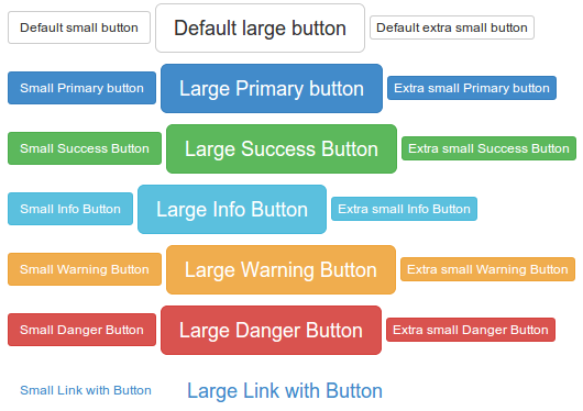
不同尺寸的按钮
这里有三种尺寸可设置。为了设置每种尺寸,需要添加一个额外的 class。
btn-lg for setting large button.
<button type="button" class="btn btn-primary btn-lg">Large button</button>
btn-lg class 的 CSS 代码如下
.btn-lg {
  padding: 10px 16px;
  font-size: 18px;
  line-height: 1.33;
  border-radius: 6px;
}
使用 btn-sm 和 btn-xs 设置带有不同尺寸的按钮。
<button type="button" class="btn btn-primary btn-sm">Large button</button>
<button type="button" class="btn btn-primary btn-xs">Large button</button>
btn-sm 和 btn-xs classe 的 CSS 代码如下
.btn-sm,
.btn-xs {
  padding: 5px 10px;
  font-size: 12px;
  line-height: 1.5;
  border-radius: 3px;
}

.btn-xs {
  padding: 1px 5px;
}
下面的代码演示了不同类型的带有不同尺寸的按钮。您可以点击这里,在线查看演示。下面是效果截屏及代码。
实例
<html>
<head>
<title>Bootstrap 3 不同尺寸的按钮</title>
<meta name="viewport" content="width=device-width, initial-scale=1.0">
<!-- Bootstrap -->
<link href="dist/css/bootstrap.min.css" rel="stylesheet" media="screen">
<style>
body {
padding: 50px
}
</style>
<!-- HTML5 Shim and Respond。js IE8支持 HTML5 原始和媒体查询。 -->
<!-- WARNING: Respond。如果通过file://查看页面js将不工作。 -->
<!--[if lt IE 9]>
<script src="https://oss.maxcdn.com/libs/html5shiv/3.7.0/html5shiv.js"></script>
<script src="https://oss.maxcdn.com/libs/respond.js/1.3.0/respond.min.js"></script>
<![endif]-->
</head>
<body>
<!-- 标准按钮 -->
<p>
<button type="button" class="btn btn-default btn-sm">默认小的按钮</button>
<button type="button" class="btn btn-default btn-lg">默认大的按钮</button>
<button type="button" class="btn btn-default btn-xs">默认特别小的按钮</button>
</p>
<p>
<!-- 提供额外的视觉效果,标识一组按钮中的原始动作 -->
<button type="button" class="btn btn-primary btn-sm">小的原始按钮</button>
<button type="button" class="btn btn-primary btn-lg">大的原始按钮</button>
<button type="button" class="btn btn-primary btn-xs">特别小的原始按钮</button>
</p>
<p>
<!-- 表示一个成功的或积极的动作 -->
<button type="button" class="btn btn-success btn-sm">小的成功按钮</button>
<button type="button" class="btn btn-success btn-lg">大的成功按钮</button>
<button type="button" class="btn btn-success btn-xs">特别小的成功按钮</button>
</p>
<p>
<!-- 信息警告消息的上下文按钮 -->
<button type="button" class="btn btn-info btn-sm">小的信息按钮</button>
<button type="button" class="btn btn-info btn-lg">大的信息按钮</button>
<button type="button" class="btn btn-info btn-xs">特别小的信息按钮</button>
</p>
<p>
<!-- 表示应谨慎采取的动作 -->
<button type="button" class="btn btn-warning btn-sm">小的警告按钮</button>
<button type="button" class="btn btn-warning btn-lg">大的警告按钮</button>
<button type="button" class="btn btn-warning btn-xs">特别小的警告按钮</button>
</p>
<p>
<!-- 表示一个危险的或潜在的负面动作 -->
<button type="button" class="btn btn-danger btn-sm">小的危险按钮</button>
<button type="button" class="btn btn-danger btn-lg">大的危险按钮</button>
<button type="button" class="btn btn-danger btn-xs">特别小的危险按钮</button>
</p>
<p>
<!-- 并不强调是一个按钮,看起来像一个链接,但同时保持按钮的行为 -->
<button type="button" class="btn btn-link btn-sm">小的链接按钮</button>
<button type="button" class="btn btn-link btn-lg">大的链接按钮</button>
</p>
<!-- jQuery (对Bootstrap的 JavaScript插件来说是必要的--->
<script src="https://code.jquery.com/jquery.js"></script>
<!-- 包括所有已编译的插件(如下),或者根据需要包括单个文件 -->
<script src="dist/js/bootstrap.min.js"></script>
</body>
</html>
块级按钮
如需使用按钮所在容器的所有宽度,Bootstrap 3 提供了块级按钮选项。您需要添加 btn-block class 到上面讨论的 class 中来创建块级按钮。
<button type="button" class="btn btn-primary btn-lg btn-block">Large button</button>
<button type="button" class="btn btn-success btn-lg btn-block">Large button</button>
创建块级按钮的 CSS 定义如下
.btn-block {
  display: block;
  width: 100%;
  padding-right: 0;
  padding-left: 0;
}

.btn-block + .btn-block {
  margin-top: 5px;
}
下面显示了块级按钮的截屏和代码。您可以 点击这里,在线查看实例。
实例
<html>
<head>
<title>Bootstrap 3 块级按钮</title>
<meta name="viewport" content="width=device-width, initial-scale=1.0">
<!-- Bootstrap -->
<link href="dist/css/bootstrap.min.css" rel="stylesheet" media="screen">
<style>
body {
padding: 50px
}
</style>
<!-- HTML5 Shim and Respond。js IE8支持 HTML5 原始和媒体查询。 -->
<!-- WARNING: Respond。如果通过file://查看页面js将不工作。 -->
<!--[if lt IE 9]>
<script src="https://oss.maxcdn.com/libs/html5shiv/3.7.0/html5shiv.js"></script>
<script src="https://oss.maxcdn.com/libs/respond.js/1.3.0/respond.min.js"></script>
<![endif]-->
</head>
<body>
<div class="container">
<div class="row">
<div class="col-lg-12">
<!-- 标准按钮 -->
<p>
<button type="button" class="btn btn-primary btn-sm btn-block">默认小的块级按钮</button>
<button type="button" class="btn btn-default btn-lg btn-block">默认大的块级按钮</button>
<button type="button" class="btn btn-primary btn-xs btn-block">默认特别小的块级按钮</button>
</p>
<p>
<!-- 提供额外的视觉效果,标识一组按钮中的原始动作 -->
<button type="button" class="btn btn-primary btn-sm btn-block">小的原始块级按钮</button>
<button type="button" class="btn btn-primary btn-lg btn-block">大的原始块级按钮</button>
<button type="button" class="btn btn-primary btn-xs btn-block">特别小的原始块级按钮</button>
</p>
<p>
<!-- 表示一个成功的或积极的动作 -->
<button type="button" class="btn btn-success btn-sm btn-block">小的成功块级按钮</button>
<button type="button" class="btn btn-success btn-lg btn-block">大的成功块级按钮</button>
<button type="button" class="btn btn-success btn-xs btn-block">特别小的成功块级按钮</button>
</p>
<p>
<!-- 信息警告消息的上下文按钮 -->
<button type="button" class="btn btn-info btn-sm btn-block">小的信息块级按钮</button>
<button type="button" class="btn btn-info btn-lg btn-block">大的信息块级按钮</button>
<button type="button" class="btn btn-info btn-xs btn-block">特别小的信息块级按钮</button>
</p>
<p>
<!-- 表示应谨慎采取的动作 -->
<button type="button" class="btn btn-warning btn-sm btn-block">小的警告块级按钮</button>
<button type="button" class="btn btn-warning btn-lg btn-block">大的警告块级按钮</button>
<button type="button" class="btn btn-warning btn-xs btn-block">特别小的警告块级按钮</button>
</p>
<p>
<!-- 表示一个危险的或潜在的负面动作 -->
<button type="button" class="btn btn-danger btn-sm btn-block">小的危险块级按钮</button>
<button type="button" class="btn btn-danger btn-lg btn-block">大的危险块级按钮</button>
<button type="button" class="btn btn-danger btn-xs btn-block">特别小的危险块级按钮</button>
</p>
<p>
<!-- 并不强调是一个按钮,看起来像一个链接,但同时保持按钮的行为 -->
<button type="button" class="btn btn-link btn-sm btn-block">小的链接块级按钮</button>
<button type="button" class="btn btn-link btn-lg btn-block">大的链接块级按钮</button>
</p>
</div>
</div>
</div>
<!-- jQuery (necessary for Bootstrap's JavaScript plugins) -->
<script src="https://code.jquery.com/jquery.js"></script>
<!-- Include all compiled plugins (below), or include individual files as needed -->
<script src="dist/js/bootstrap.min.js"></script>
</body>
</html>

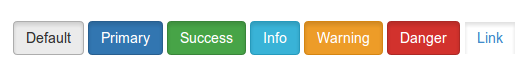
活动的按钮
您可以使用 active CSS class 来给按钮或链接添加不同的外观,以显示它是活动的。这里是一个 实例演示、截屏和代码。
实例
<html>
<head>
<title>Bootstrap 3 活动按钮</title>
<meta name="viewport" content="width=device-width, initial-scale=1.0">
<!-- Bootstrap -->
<link href="dist/css/bootstrap.min.css" rel="stylesheet" media="screen">
<style>
body {
padding: 50px
}
</style>
<!-- HTML5 Shim and Respond。js IE8支持 HTML5 原始和媒体查询。 -->
<!-- WARNING: Respond。如果通过file://查看页面js将不工作。 -->
<!--[if lt IE 9]>
<script src="https://oss.maxcdn.com/libs/html5shiv/3.7.0/html5shiv.js"></script>
<script src="https://oss.maxcdn.com/libs/respond.js/1.3.0/respond.min.js"></script>
<![endif]-->
</head>
<body>
<!-- 标准按钮 -->
<button type="button" class="btn btn-default active">默认</button>
<!-- 提供额外的视觉效果,标识一组按钮中的原始动作 -->
<button type="button" class="btn btn-primary active">原始</button>
<!-- 表示一个成功的或积极的动作 -->
<button type="button" class="btn btn-success active">成功</button>
<!-- 信息警告消息的上下文按钮 -->
<button type="button" class="btn btn-info active">信息</button>
<!-- 表示应谨慎采取的动作 -->
<button type="button" class="btn btn-warning active">警告</button>
<!-- 表示一个危险的或潜在的负面动作 -->
<button type="button" class="btn btn-danger active">危险</button>
<!-- 并不强调是一个按钮,看起来像一个链接,但同时保持按钮的行为 -->
<button type="button" class="btn btn-link active">链接</button>
<!-- jQuery (对Bootstrap的 JavaScript插件来说是必要的--->
<script src="https://code.jquery.com/jquery.js"></script>
<!-- 包括所有已编译的插件(如下),或者根据需要包括单个文件 -->
<script src="dist/js/bootstrap.min.js"></script>
</body>
</html>
使用 Chrome 开发者工具,我们会发现当按钮被添加了 active class 时,CSS 规则生效。
Default 活动按钮
.btn-default:hover, .btn-default:focus, .btn-default:active, .btn-default.active, .open .dropdown-toggle.btn-default {
color: #333;
background-color: #ebebeb;
border-color: #adadad;
}
Primary 活动按钮
.btn-primary:hover, .btn-primary:focus, .btn-primary:active, .btn-primary.active, .open .dropdown-toggle.btn-primary {
color: #fff;
background-color: #3276b1;
border-color: #285e8e;
}
Success 活动按钮
.btn-success:hover, .btn-success:focus, .btn-success:active, .btn-success.active, .open .dropdown-toggle.btn-success {
color: #fff;
background-color: #47a447;
border-color: #398439;
}
Info 活动按钮
.btn-info:hover, .btn-info:focus, .btn-info:active, .btn-info.active, .open .dropdown-toggle.btn-info {
color: #fff;
background-color: #39b3d7;
border-color: #269abc;
}
Warning 活动按钮
.btn-warning:hover, .btn-warning:focus, .btn-warning:active, .btn-warning.active, .open .dropdown-toggle.btn-warning {
color: #fff;
background-color: #ed9c28;
border-color: #d58512;
}
Danger 活动按钮
.btn-danger:hover, .btn-danger:focus, .btn-danger:active, .btn-danger.active, .open .dropdown-toggle.btn-danger {
color: #fff;
background-color: #d2322d;
border-color: #ac2925;
}
Link 活动按钮
.btn-link, .btn-link:hover, .btn-link:focus, .btn-link:active {
border-color: transparent;
}
所以,您可以看到这些是通过改变 color、backgound-color 和 border-color 属性来实现的。
禁用的按钮
您可以使用 disabled CSS class 来给按钮或链接添加不同的外观,以显示它是禁用的。这里是一个 实例演示、截屏和代码。
为了使按钮有点模糊,使用下面的 CSS 规则(通过 Chrome 开发者工具查找)
.btn[disabled], fieldset[disabled] .btn {
pointer-events: none;
cursor: not-allowed;
opacity: .65;
filter: alpha(opacity=65);
-webkit-box-shadow: none;
box-shadow: none;
}
实例
<html>
<head>
<title>Bootstrap 3 禁用按钮</title>
<meta name="viewport" content="width=device-width, initial-scale=1.0">
<!-- Bootstrap -->
<link href="dist/css/bootstrap.min.css" rel="stylesheet" media="screen">
<style>
body {
padding: 50px
}
</style>
<!-- HTML5 Shim and Respond。js IE8支持 HTML5 原始和媒体查询。 -->
<!-- WARNING: Respond。如果通过file://查看页面js将不工作。 -->
<!--[if lt IE 9]>
<script src="https://oss.maxcdn.com/libs/html5shiv/3.7.0/html5shiv.js"></script>
<script src="https://oss.maxcdn.com/libs/respond.js/1.3.0/respond.min.js"></script>
<![endif]-->
</head>
<body>
<!-- 标准按钮 -->
<button type="button" class="btn btn-default" disabled="disabled">默认</button>
<!-- 提供额外的视觉效果,标识一组按钮中的原始动作 -->
<button type="button" class="btn btn-primary" disabled="disabled">原始</button>
<!-- 表示一个成功的或积极的动作 -->
<button type="button" class="btn btn-success" disabled="disabled">成功</button>
<!-- 信息警告消息的上下文按钮 -->
<button type="button" class="btn btn-info" disabled="disabled">信息</button>
<!-- 表示应谨慎采取的动作 -->
<button type="button" class="btn btn-warning" disabled="disabled">警告</button>
<!-- 表示一个危险的或潜在的负面动作 -->
<button type="button" class="btn btn-danger" disabled="disabled">危险</button>
<!-- jQuery (对Bootstrap的 JavaScript插件来说是必要的--->
<script src="https://code.jquery.com/jquery.js"></script>
<!-- 包括所有已编译的插件(如下),或者根据需要包括单个文件 -->
<script src="dist/js/bootstrap.min.js"></script>
</body>
</html>
禁用的锚元素
当带有 btn 和其他相关的 class 的锚元素呈现为禁用状态时,它与平常有点不同。首先,锚元素的链接仍然存在,只有外观和感观改变了。此外,您不能在导航栏中使用它们。
点击这里,在线查看演示。代码如下:
实例
<html>
<head>
<title>Bootstrap 3 禁用锚按钮</title>
<meta name="viewport" content="width=device-width, initial-scale=1.0">
<!-- Bootstrap -->
<link href="dist/css/bootstrap.min.css" rel="stylesheet" media="screen">
<style>
body {
padding: 50px
}
</style>
<!-- HTML5 Shim and Respond。js IE8支持 HTML5 原始和媒体查询。 -->
<!-- WARNING: Respond。如果通过file://查看页面js将不工作。 -->
<!--[if lt IE 9]>
<script src="https://oss.maxcdn.com/libs/html5shiv/3.7.0/html5shiv.js"></script>
<script src="https://oss.maxcdn.com/libs/respond.js/1.3.0/respond.min.js"></script>
<![endif]-->
</head>
<body>
<!-- 标准按钮 -->
<a href="http://www.example.com" class="btn btn-default disabled" role="button">默认</a>
<!-- 提供额外的视觉效果,标识一组按钮中的原始动作 -->
<a href="http://www.example.com" class="btn btn-primary disabled" role="button">原始</a>
<!-- 表示一个成功的或积极的动作 -->
<a href="http://www.example.com" class="btn btn-success disabled" role="button">成功</a>
<!-- 信息警告消息的上下文按钮 -->
<a href="http://www.example.com" class="btn btn-info disabled" role="button">信息</a>
<!-- 表示应谨慎采取的动作 -->
<a href="http://www.example.com" class="btn btn-warning disabled" role="button">警告</a>
<!-- 表示一个危险的或潜在的负面动作 -->
<a href="http://www.example.com" class="btn btn-danger disabled" role="button">危险</a>
<!-- jQuery (对Bootstrap的 JavaScript插件来说是必要的--->
<script src="https://code.jquery.com/jquery.js"></script>
<!-- 包括所有已编译的插件(如下),或者根据需要包括单个文件 -->
<script src="dist/js/bootstrap.min.js"></script>
</body>
</html>
请注意,role="button" 是为了便于使用的目的而使用的。
按钮标签
您可以通过 button、a 和 input 元素使用按钮 class,来把按钮当成标签使用。但是推荐您通常是通过 button 元素来使用,否则它将引起跨浏览器不一致问题。
下面的实例演示了如何使用按钮标签
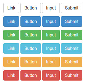
实例
<html>
<head>
<title>Bootstrap 3 按钮标签实例</title>
<meta name="viewport" content="width=device-width, initial-scale=1.0">
<!-- Bootstrap -->
<link href="dist/css/bootstrap.min.css" rel="stylesheet" media="screen">
<style>
body {
padding: 50px
}
</style>
<!-- HTML5 Shim and Respond。js IE8支持 HTML5 原始和媒体查询。 -->
<!-- WARNING: Respond。如果通过file://查看页面js将不工作。 -->
<!--[if lt IE 9]>
<script src="https://oss.maxcdn.com/libs/html5shiv/3.7.0/html5shiv.js"></script>
<script src="https://oss.maxcdn.com/libs/respond.js/1.3.0/respond.min.js"></script>
<![endif]-->
</head>
<body>
<p>
<a class="btn btn-default" href="#" role="button">链接</a>
<button class="btn btn-default" type="submit">按钮</button>
<input class="btn btn-default" type="button" value="输入">
<input class="btn btn-default" type="submit" value="提交">
</p>
<p>
<a class="btn btn-primary" href="#" role="button">链接</a>
<button class="btn btn-primary" type="submit">按钮</button>
<input class="btn btn-primary" type="button" value="输入">
<input class="btn btn-primary" type="submit" value="提交">
</p>
<p>
<a class="btn btn-success" href="#" role="button">链接</a>
<button class="btn btn-success" type="submit">按钮</button>
<input class="btn btn-success" type="button" value="输入">
<input class="btn btn-success" type="submit" value="提交">
</p>
<p>
<a class="btn btn-info" href="#" role="button">链接</a>
<button class="btn btn-info" type="submit">按钮</button>
<input class="btn btn-info" type="button" value="输入">
<input class="btn btn-info" type="submit" value="提交">
</p>
<p>
<a class="btn btn-warning" href="#" role="button">链接</a>
<button class="btn btn-warning" type="submit">按钮</button>
<input class="btn btn-warning" type="button" value="输入">
<input class="btn btn-warning" type="submit" value="提交">
</p>
<p>
<a class="btn btn-danger" href="#" role="button">链接</a>
<button class="btn btn-danger" type="submit">按钮</button>
<input class="btn btn-danger" type="button" value="输入">
<input class="btn btn-danger" type="submit" value="提交">
</p>
<!-- jQuery (对Bootstrap的 JavaScript插件来说是必要的--->
<script src="https://code.jquery.com/jquery.js"></script>
<!-- 包括所有已编译的插件(如下),或者根据需要包括单个文件 -->
<script src="dist/js/bootstrap.min.js"></script>
</body>
</html>
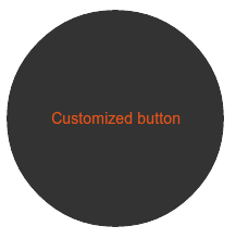
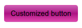
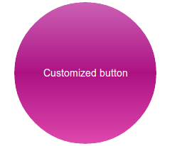
定制按钮
现在我们将以默认按钮开始进行定制,让它拥有一个完全不同的外观和感观。
我们将按如下的按钮代码开始
<button type="button" class="btn btn-default">Default</button>
现在我们要创建一个 CSS class btn-w3r,并用它替换 btn-default。所以,我们将编写如下代码来取代上面的代码
<button type="button" class="btn btn-w3r">Default</button>
首先我们将改变背景颜色,添加如下的 CSS
.btn-w3r {
    background: #cb60b3; /* Old browsers */
    background: -moz-linear-gradient(top,  #cb60b3 0%, #ad1283 50%, #de47ac 100%); /* FF3.6+ */
    background: -webkit-gradient(linear, left top, left bottom, color-stop(0%,#cb60b3), color-stop(50%,#ad1283), color-stop(100%,#de47ac)); /   *   Chrome,Safari4+ */
    background: -webkit-linear-gradient(top,  #cb60b3 0%,#ad1283 50%,#de47ac 100%); /* Chrome10+,Safari5.1+ */
    background: -o-linear-gradient(top,  #cb60b3 0%,#ad1283 50%,#de47ac 100%); /* Opera 11.10+ */
    background: -ms-linear-gradient(top,  #cb60b3 0%,#ad1283 50%,#de47ac 100%); /* IE10+ */
    background: linear-gradient(to bottom,  #cb60b3 0%,#ad1283 50%,#de47ac 100%); /* W3C */
    filter: progid:DXImageTransform.Microsoft.gradient( startColorstr='#cb60b3', endColorstr='#de47ac',GradientType=0 ); /* IE6-9 */
    }
现在按钮如下所示
如需改变字体颜色,我们将在已存在的 btn-w3r class 的 CSS 代码后追加如下的 CSS
color:#fff;
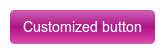
现在,为了让按钮形状看起来像圆形,我们将在已存在的 btn-w3r class 的 CSS 代码前添加如下的 CSS
width: 200px;
    height: 200px;
    -moz-border-radius: 50%;
    -webkit-border-radius: 50%;
    border-radius: 50%;
如需添加一个悬停效果,我们将添加如下的 CSS 代码
.btn-w3r:hover {
    background: #333;
    color:#e75616;
    }
下面是添加上述 CSS 代码后的按钮悬停效果