×
关于

Vaadin Web 开发教程

概述安装开发环境Vaadin 应用程序框架介绍开始编写 Web 应用Vaadin Web 应用的基本组成部分使用资源UI 组件概述UI 组件-LabelUI 組件-LinkUI 組件-TextFieldUI 組件-TextAreaUI 組件-PasswordFieldUI 組件-RichTextAreaUI 組件-ButtonUI 組件-CheckboxUI 组件-Select 组件UI 组件-Table 组件UI 组件-Tree 组件UI 组件-MenuBar 组件UI 组件-Embedded 组件UI 组件-Upload 组件UI 组件-Form 组件UI 组件-ProgressIndicator 组件UI 组件-Slider 组件UI 组件-LoginForm 组件UI 组件-自定义组件UI 布局-概述UI 布局-VerticalLayout 和 HorizontalLayout 布局UI 布局-GridLayout 布局UI 布局-FormLayout 布局UI 布局-PanelUI 布局-HorizontalSplitPanel 和 VerticalSplitPanel 布局UI 布局-TabSheet 布局UI 布局-Accordion 布局UI 布局-AbsoluteLayout 布局可視化界面編輯插件使用主题-概述使用主题-创建和应用新主题数据绑定-概述数据绑定-Property 接口使用 Item 介面管理一組 Property使用 Container 介面管理一組 ItemSQLContainer 概述开始使用 SQLContainerSQLContainer-过滤及排序SQLContainer-编辑SQLContainer-引用其它 SQLContainerSQLContainer-使用 FreeformQuery

UI 组件-自定义组件


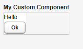
Vaadin 支持自定义组件,典型的用法是将各种 Vaadin 内置的组件组合而成构成自定义组件。 创建自定义组件可以通过派生 CustomComponent 然后调用 setCompositionRoot 为自定义组件设置根容器。 例如:

class MyComposite extends CustomComponent {
    public MyComposite(String message) {
        // A layout structure used for composition
        Panel panel = new Panel("My Custom Component");
        panel.setContent(new VerticalLayout());

        // Compose from multiple components
        Label label = new Label(message);
        label.setSizeUndefined(); // Shrink
        panel.addComponent(label);
        panel.addComponent(new Button("Ok"));

        // Set the size as undefined at all levels
        panel.getContent().setSizeUndefined();
        panel.setSizeUndefined();
        setSizeUndefined();

        // The composition root MUST be set
        setCompositionRoot(panel);
    }}

需要注意的是,如果希望自定义的组件自适应其所包含的其它UI组件,必须将容器的大小设为“未定义”,如上面的 setSizeUndefined 方法就是起这个作用。 构造自定义组件,也可以从其它 Vaadin 内置 UI 组件派生,或者利用 Google Web Toolbit 提供的组件创建全新的 Vaadin UI 组件(后面介绍)。

Tags: Java EE, Vaadin, Web


分类导航

关注微信下载离线手册

bootwiki移动版 bootwiki
(群号:472910771)